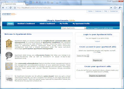
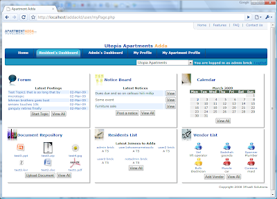
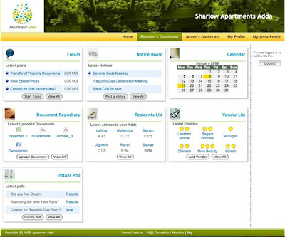
This is a post I wanted to write for a long time. Here are some screenshots of how Apartment Adda looked at different stages.
October 2007 : I spent a weekend creating a prototype of Apartment Adda. Got an open source web design template from owsd.org and was able to quickly create a working site.
We had one goal for our UI to begin with. When a user logs in he need not click on different pages to see what is happening in his or her Adda. In one click he should get to see all the updates and also get a bird’s eye view of everything – without getting flooded with information.
We finally came up with a dashboard design that will show the latest updates in nice little widgets – where each widget will act like a summary page for the detailed page.
Resident’s Dashboard :
Admin’s Dashboard :
While I was developing the site, simultaneously we got the help of a UI design firm – Cicada Media, Bangalore. Mr. Binil designed the vibrant Apartment Adda logo and Mr.Balaji designed the style sheets, buttons and layout. Many thanks to Cicada team for the UI upgrade of Apartment Adda !!
Here is how Apartment Adda looks as of today.
HomePage :
Resident’s Dashboard :
Admin’s Dashboard :
Thanks for visiting Apartment Adda’s Baby scrap page !!


